

The System
ios App, 2017
WHAT: The System is an app that creates and keeps a simplified “macro budget” for you so you can stop overspending and get ahead.
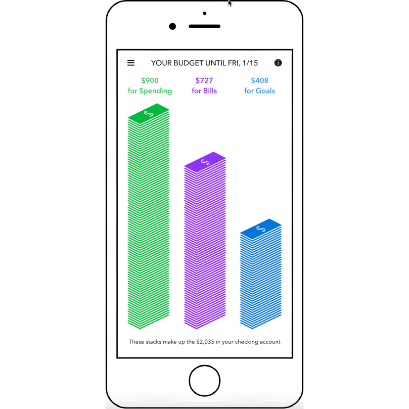
HOW: The System organizes your checking account into 3 categories--for Spending, for Bills, and for Goals--then tells you what Goals to target in what order.
WHY: An astonishing 78% of Americans live paycheck to paycheck. Getting ahead requires financial savvy and considerable discipline, and and few of us have both.
WHO: This app is targeting single, salaried Millennials who feel overwhelmed and stressed out about getting their finances in order.
Visit website
Setup
The System starts with a white stack of money representing your income. Then, it divides that stack into purple, blue, and green for Bills, Goals, and Spending.

Setup: Design Process

Observation & Problem Statement
Everyone I spoke to hated making budgets. They complained about the tedium of making a budget by hand, and they complained about the inaccuracy of automatic budgets like the ones Mint creates.
Problem Statement: How might we keep a user’s finances on track without a traditional budget?

The Big Idea: Macro-Budgeting
For a user to break the paycheck-to-paycheck cycle, their income needs to serve three purposes: pay for essentials like bills, pay for everyday spending, and work towards financial goals (like debt payoff, saving, or investing). In the interest of simplicity, I wanted to partition a user’s money into just these three categories. I called this a “Macro-Budget”.

Exploration: Isometric Stacks
It sounds obvious, but research shows that consumers have an easier time associating graphics with money if the graphics actually depict money. I first tried out the isometric look for an animated demo I made, shown here.

Experiment: Concierge Prototype
To test the concept of 3-category macro-budgeting, I devised a “Concierge Prototype” of the service. I asked 8 test users to share their transaction data with me, and used statistical analysis to determine their paycheck and monthly bills.
I used that information to break their income down into the three categories I was focusing on. I created a financial assessment and emailed it to them as a PDF. The dollar graphic and visual breakdown tested well and gave me the confidence to move forward with an app design.

Testing: Clickable Prototype
My next step was to translate the PDF Concierge Prototype into a mobile app. This animation is from a clickable prototype I put on my phone for in-person testing.
The most frustrating aspect was that I had to used canned figures for income and bills, and the inauthenticity was a distraction for users.

Final Version
Users felt the Setup process was too long, so I used chevrons to indicate what step they were on.
Finally, I added a screen at the end we called “Your Paycheck Plan” to summarize the user’s new paycheck budget.

Home
On the Home screen, your checking account is organized into stacks for Spending, Bills, and Goals.
Home: Design Process

Observation & Problem Statement
In a competitive assessment of personal finance apps, some users expressed frustration with the reliance of pie/donut charts as the only significant graphic component. One user said, “A pie chart show proportion. It doesn’t show me how much I’ve spent or how much is left”.
Problem statement: How might we visualize a user’s money in a way that helps them understand where they stand financially?

Spent Money on Home Screen?
I originally wanted to show spent money—depicted in gray portions of the stacks—on the Home screen. I thought it was important to show how much had been spent since payday. Turns out, users found the gray portions confusing at first, so I got rid of them. As a result, the Home screen was much more vibrant.

Final Version
I wanted a crystal-clear connection between the Three Stacks on the Home Screen and the contents of each stack. The answer was to split the stack apart to show how each stack was earmarked. The animation also added a little visual delight, and users liked it.
Spending
The System tells you exactly how much you can afford to spend until payday. It even gives you a daily average so you can pace yourself.

Spending: Design Process
Observation & Inspiration
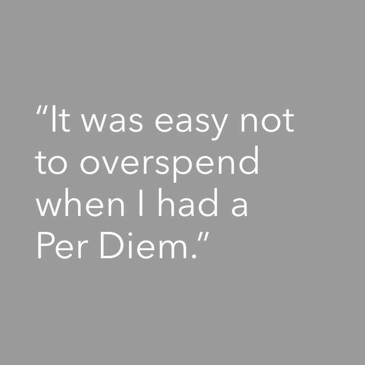
The most common financial issue in my interviews and online surveys was overspending. When I asked, “Was there a time when you felt your spending was in line with your earning?”, a subject talked about a recent work trip when they had a Per Diem. Determined to not spend any of their own money, they stuck to the $75/day allowance their company offered them for a week. I wanted to explore this idea to see if a user’s own spending money could be structured as a Per Diem.
Problem statement: Could an allowance help users pace their own spending?

The Big Idea: Per Diem as Allowance for Grownups
To test this idea, I created a spreadsheet on my phone that divided my checking balance by the number of days until payday. Every day I would enter my balance, and it would calculate a daily average or “Per Diem”. While I never spent exactly my Per Diem, there was a natural feedback loop which allowed me to pace my spending. If my Per Diem went down one day, I knew to cool it until it went back up again. I loved this and wanted to incorporate this in the app.

Exploration: What does a Per Diem look like?
This is an early implementation of three different toggles of the same screen. This is the first time I split the stack apart to show a daily spending amount, a design which carries through to today.

Exploration: Spent vs. Remaining Money
I got positive feedback from my users for the isometric stacks design I used in the Concierge Version, so I decided to move forward with it. Here are a bunch of different sketches I made of how they could be arranged to show your Spending Per Day. I chose to use gray to denote spent money so the user could tell at a glance what was spent vs. what was remaining.

Exploration: How to Communicate Amount?
When you look at a bank statement, there’s little visual difference between an $19 expense and a $91 expense. At a glance, the glyphs take up the same amount of space even though there’s a nearly 5x difference in value. So I took the opportunity to show a different stack height for different amounts of money whether it was spent (gray) or remaining (green).

Final Design
At the top are different amounts of spent money arranged by day, followed by the remaining Per Diem. At the bottom is the anticipated next paycheck.

Bills
Money is earmarked for upcoming bills so you always have enough to pay in full and on time.
Bills: Design Process
Observation & Inspiration
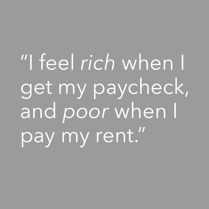
One of the people I spoke to explained that her attitude towards money shifted dramatically when she paid her rent, as it was her biggest expense by far. I was inspired to see how our fixed monthly expenses could be balanced out throughout the month to alleviate this lopsided situation.
Problem statement: How might we smooth out a user’s cashflow so they don’t ride the rich-poor rollercoaster?

Experiment: Balancing Expenses Over Time
To try this idea out, I tallied up all my fixed monthly expenses aside from my rent and found the total was about the same as my rent. Since my rent is due on the 1st of the month, I manually changed the due dates for all my other bills to the 15th of the month. Since I got paid twice a month, I saw that if I put my first paycheck of the month towards my rent, and the second paycheck of the month towards all my other bills, I would have approximately the same amount left over to spend.

The Big Idea: Prorating Per Paycheck
About half the US is paid weekly or every other week, which doesn’t line up nicely with monthly expenses. While the original idea was to balance monthly expenses across two paychecks, I realized I needed to make the system more flexible. If enough of a cushion was saved up initially, you would be able to prorate all fixed expenses per paycheck, resulting in smooth cash flow.

Exploration: What Does Prorating Look Like?
The first priority of the Bills feature was to make sure the user had 100% of the money needed for bills that were due before payday—these I termed “Near-term Bills.” The second priority was to earmark 50% of the money needed for bills due after payday, which I called “Far-term Bills.”
I first set out to make a chart that showed what was earmarked for Near-term bills vs Far-term Bills to see if people could understand it. The full rectangles compared to the rectangles made of dotted line tested well, so they persist in the design today.

Explorations: Color and Layout of the Dollar Stack
The dollar stack graphic was a big hit with the users of our Concierge Prototype. I played around a bit to find a balance between information density and busy-ness. I also tried out using red instead of purple to represent bills, but eventually went back to purple.
Final Version
At the top are different amounts of paid bills, followed by the remaining earmarks for Near-term Bills. At the bottom are the partial earmarks for Far-term Bills.
Goals
Any remaining money is earmarked for financial goals in this order: First Pay off debt, then Build an Emergency Fund, and finally Invest.

Goals: Design Process

Observation & Problem Statement
During interviews, many people didn’t know how compounding interest worked or different between a 401(k) and an IRA. Their eyes glazed over when I would try to explain it to them, and would eventually admit that they didn’t want to learn. One said, “I don’t want to learn the finer points of personal finance. Just tell me what to do!”
Problem Statement: How might we allow users to reach their financial goals without having to define them themselves?

The Big Idea: Don't Ask What They Want, Give Them a Plan
For my initial set of test users, I customized this “Goals Checklist” according to my analysis of their financial situation and sent it to them as a PDF during the Concierge version of the service. They found the sequential aspect satisfying, but the most telling response I got was “That’s great, but can you just do it for me?”. I realized there’s a whole segment of the population who doesn’t want empowerment per se, they want automation.

Explorations: Goals
Our users didn’t want to choose their goals, learn about money, or discuss their finances, they just wanted the best practices of Personal Finance applied to their situation. I took the checklist from the Concierge version and sketched out a few designs for an interface that displayed (1) the entire list of goals, (2) which goals they had achieved, (3) and what their progress was in the current goal.

Explorations: Partial Stacks
Once I had decided to represent money with the stack graphic, I needed a way to show progress towards a goal using the stack. The idea of showing a clear or vacant portion of the stack was moderately successful in testing, but it was the dotted-line approach that best communicated anticipated funds. This is also used in the Bills section to represent bill money that is only partially earmarked.

Final Design
Here’s how Goals works: Any money left over after Spending and Bills is directed towards Goals in a specific order, depending on the user’s balances in their savings account and on their credit cards. If we detect any high-interest debt, that is prioritized first. If there’s multiple credit card debts, we prioritize the smallest debt first, using the Debt Snowball methodology.
Once the debt is paid off, we focus on savings. If we detect less than a 3-month Emergency Fund in the user’s Savings account, that’s the next priority.
Visit TheSystem.app
Read more about the thinking behind The System in the following posts and articles: