

Stealth Genetics Startup
Web App, 2019
WHAT: A new genetic testing service focused on chronic disease.
HOW: We show you which gene mutations you have that are linked to your specific condition.
WHY: Knowing which gene mutations you have can help inform better treatment.
WHO: Initially, ME/CFS (Myalgic Encephalomyelitis/Chronic Fatigue Syndrome) patients, with other conditions to follow.
Landing Page
For this new genetics service, I chose to use different faces in different tints to represent the phenotypic variety our genes are responsible for. The image also communicates that chronic disease can happen to anyone, regardless of age, race, or gender.

Design Process

At first, I wanted to see how it would look to slightly overlap a series of different faces in the colors of our new palette. These are test images I found through an image search, so they have different lighting and angles.

The design starts to look interesting once I made the overlapping more pronounced—where about half the face is overlapped with another face.

After some hunting, I finally found a collection of photos on iStockPhotos of very different people in the same lighting and the same expressionless, forward-facing pose. I tried to choose faces that could have been one of a number of different ethnicities. Colorizing the faces later would further obscure a distinct ethnicity.

After a lot of playing around, I settled on an order. I wanted a good mix of age, gender, and ethnicity to make the layout visually interesting.

After cropping the photos and colorizing them in the brand colors, the effect is complete.
All Health Reports screen
This new service focuses on gene variants linked to specific diseases, organs, and symptoms. Adding icons and color livened up what could have been an especially dull list.
This is the jumping off point, where users choose the disease they have. Upon launch, we will only have ME/CFS ready, but other diseases will soon follow.

Design Process

It was just a quick and dirty sketch, but I realized that if I used our limited color palette to give the report tiles a bit of visual interest, we wouldn't be able to use those colors as visual cues elsewhere. I later decided to reserve green and orange to indicate the lack of or presence of a mutation, and purple-blue was used for hyperlinks.

Giving the tiles a charcoal background was better, but still too dreary. And the padding was too great between the tiles.

Changing from a background color to a colored outline made the layout feel much less heavy. The visual language is being established here—the blue is used to indicate hypertext, and the magenta is used for titles. Further refinement includes tightened-up padding, slight pin-striping to give the page organization, and the addition of small icons to give the page more visual interest.
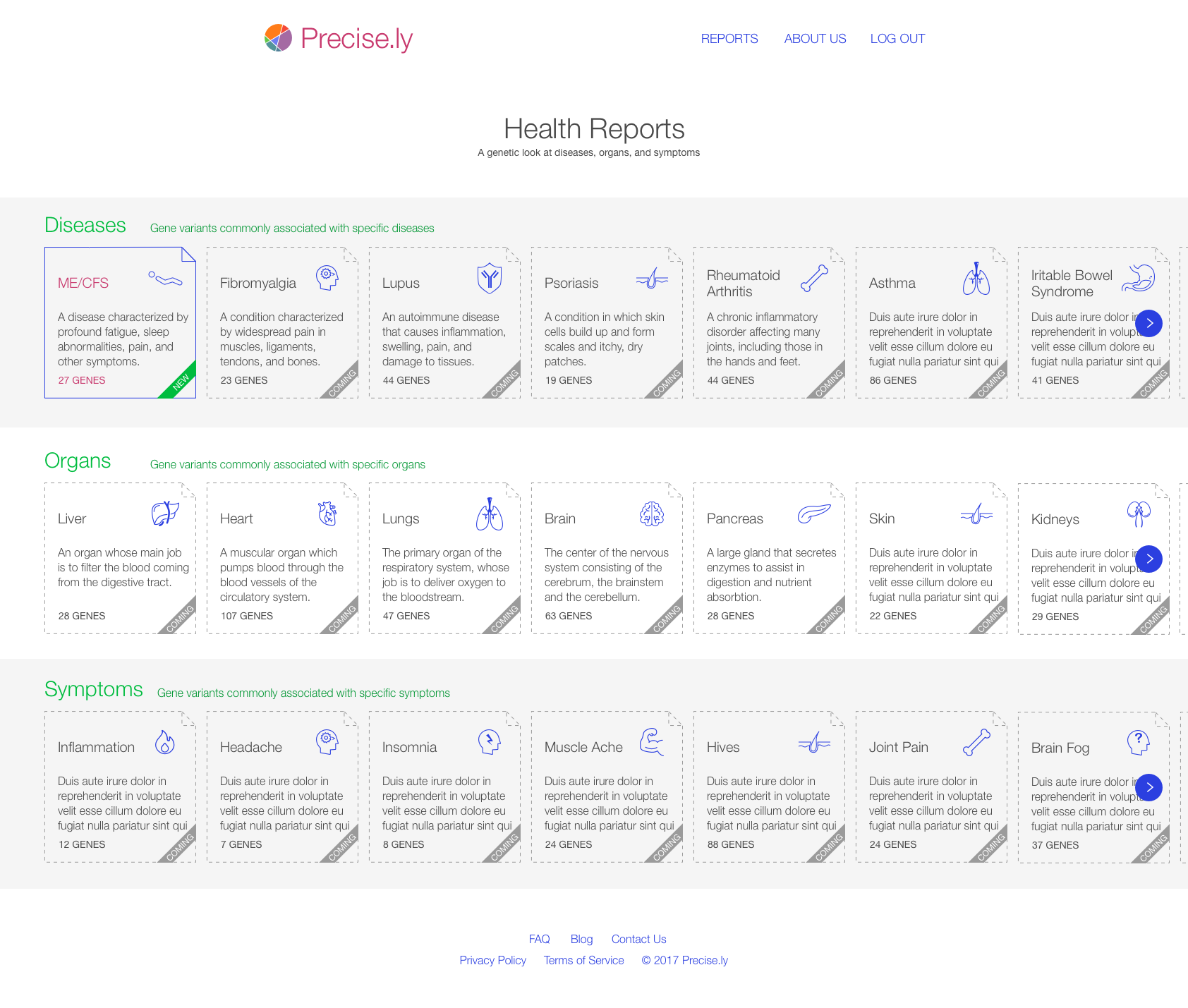
The final touches that make the screen complete were making the tiles square for a cleaner look, adding a corner fold to indicate that the tiles represent documents and thus reports, and including the total gene count at the bottom of each tile to manage user expectations.
Disease Report Screen
Upon selecting a particular disease, the user is presented with the Disease Report. The Disease Report gives a brief outline of the disease, and shows the genes whose mutations have been associated with that disease.
The challenge here was how to make what could have been an all-text screen more visually interesting. Each gene in the report is represented with a strand of DNA and color coded to indicate whether the user has a mutation or not. The user instantly knows their test results, and can explore how their gene mutations may be affecting their health.

Design Process
At first, we didn’t really know what we would say on the Disease Report. We knew we wanted a description of the disease, a list of the gene variants the user had that contribute to the disease, and maybe a histogram explaining how the user’s variants compared to other disease sufferers. Beyond that, we weren’t sure what to present.

We tried including a description of what each gene was responsible for, and whether the impact of that gene mutation was “high” or “low”. But designating a genetic mutation as having high or low impact is too reductive—it’s really the combination of genes that cause disease. Visually, it’s still too text heavy and boring.

The founders wanted to see an at-a-glance description of the disease, so I added a right-hand sidebar in a question-and-answer format. But the design remains too text heavy and dull.

Looking for ways to rely on iconography instead of text, I thought of creating a mini helix icon to represent each gene that contributed to the disease we’re focusing on. There’s not really a need to explain what the gene does on this screen, so we removed that.
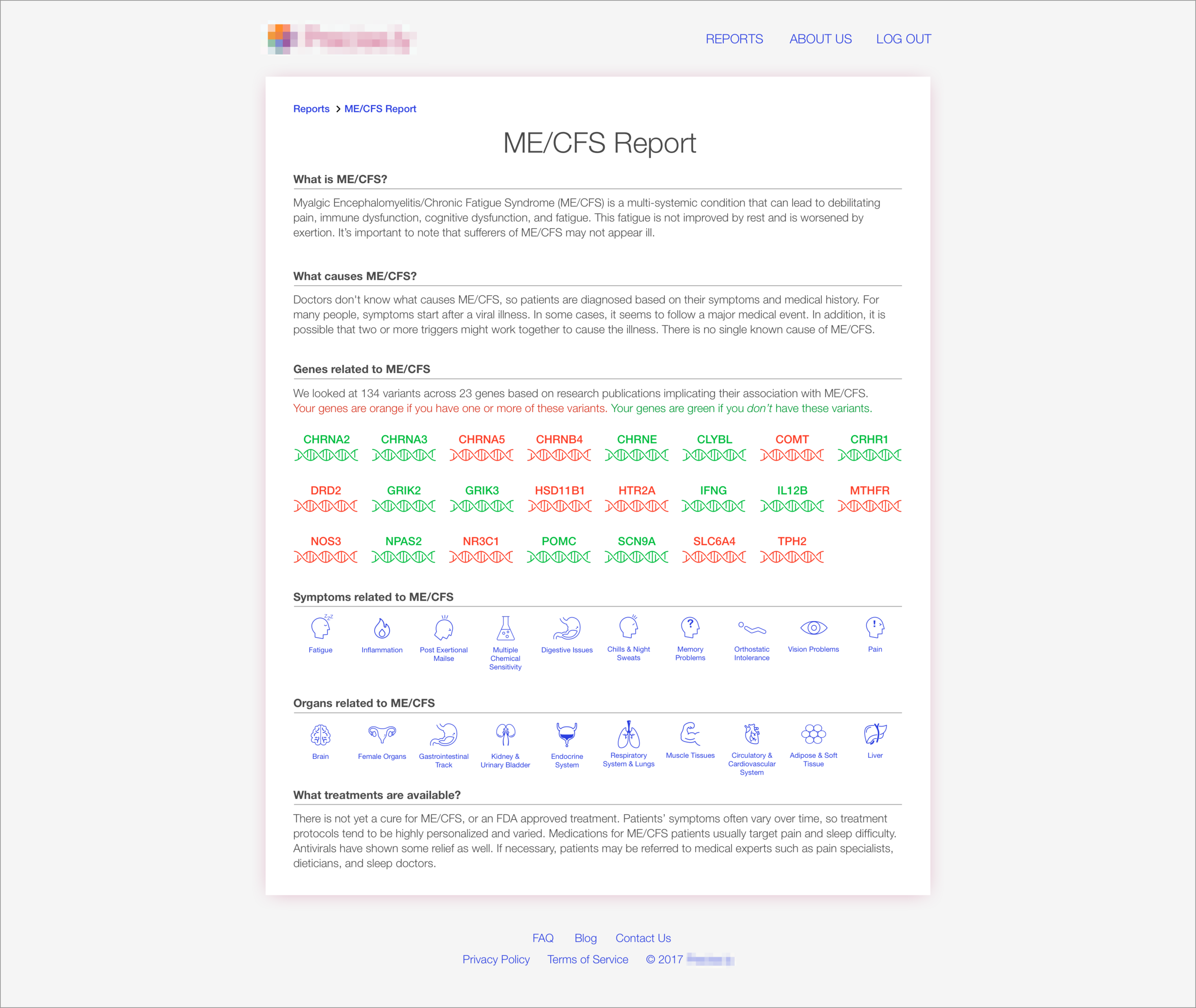
By organizing the bright blue symptom and organ icons into neat rows just below the orange and green gene icons, I had finally created enough functional visual interest to liven up the screen. I also got rid of any vertical sidebars in the web app and went to an entirely horizontal layout style, which is much cleaner.
Gene Report Screen
For each disease, we focus on a series of genetic mutations that appear to contribute to that disease. For example: if there are 10 genes common to Crohn’s disease, the Crohn’s disease report will have 10 gene reports. After we analyze your DNA, you can see which variants you have, if any, for a specific gene, what the effects may be, and what that means for your treatment.

Design Process

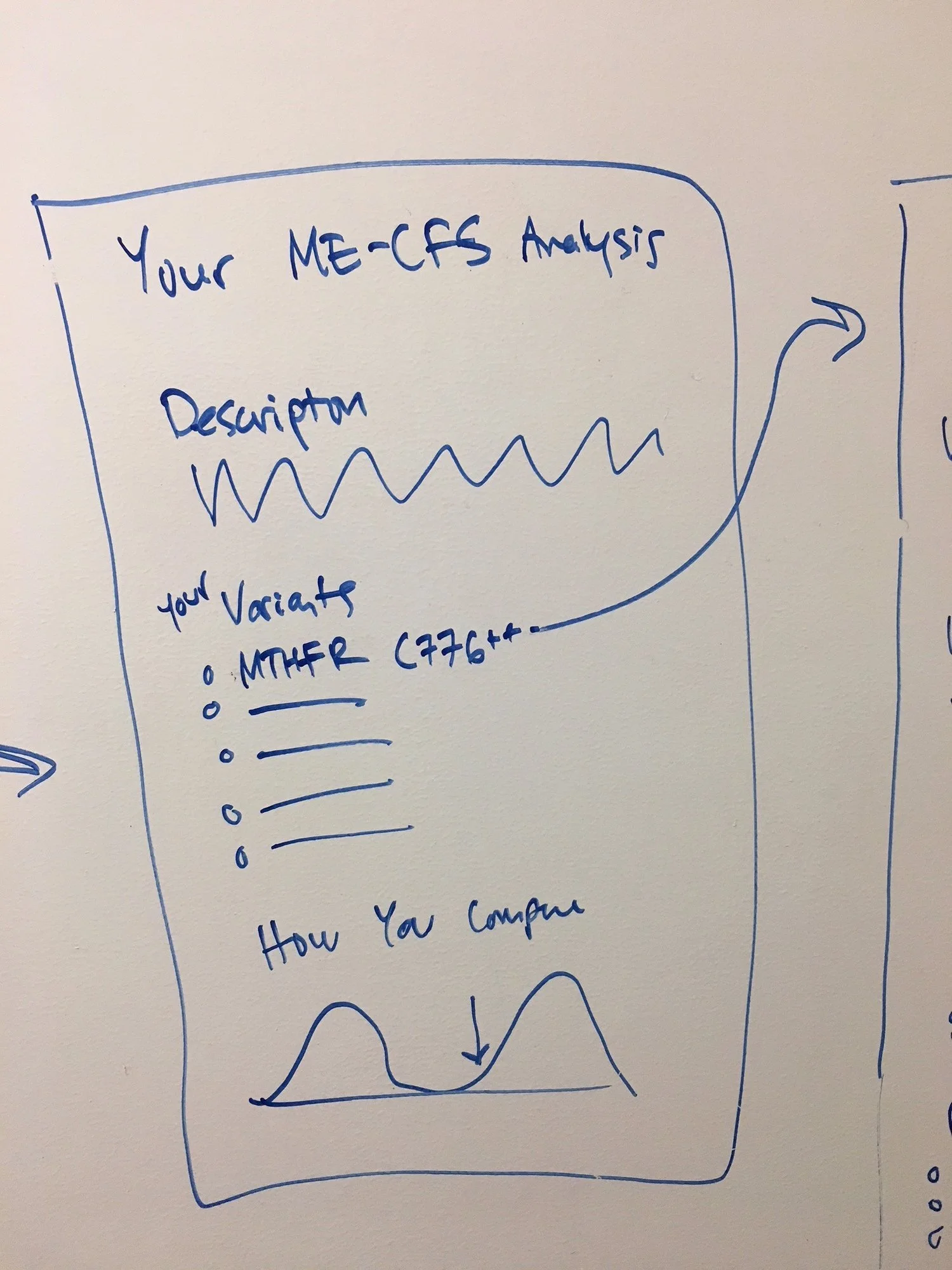
In this early sketch, the report is divided into two columns: the left column states general information about the gene, while the right column shows the user what variants, if any, the user has, and what it means.
The persona for our typical user was someone worn down by their condition, frustrated with the medical establishment, and seeking answers. This early sketch bombarded the user with data that wasn’t pertinent to them, and the text-heavy layout and restrained use of color was visually dull.

Going from one extreme to another, this next version was cleaner but colorful to the point of distraction. Clearly the overlapping area graph background wasn’t going to work, but the yellow callout box successfully got the user’s attention and game them the answer they were seeking: what are my results?
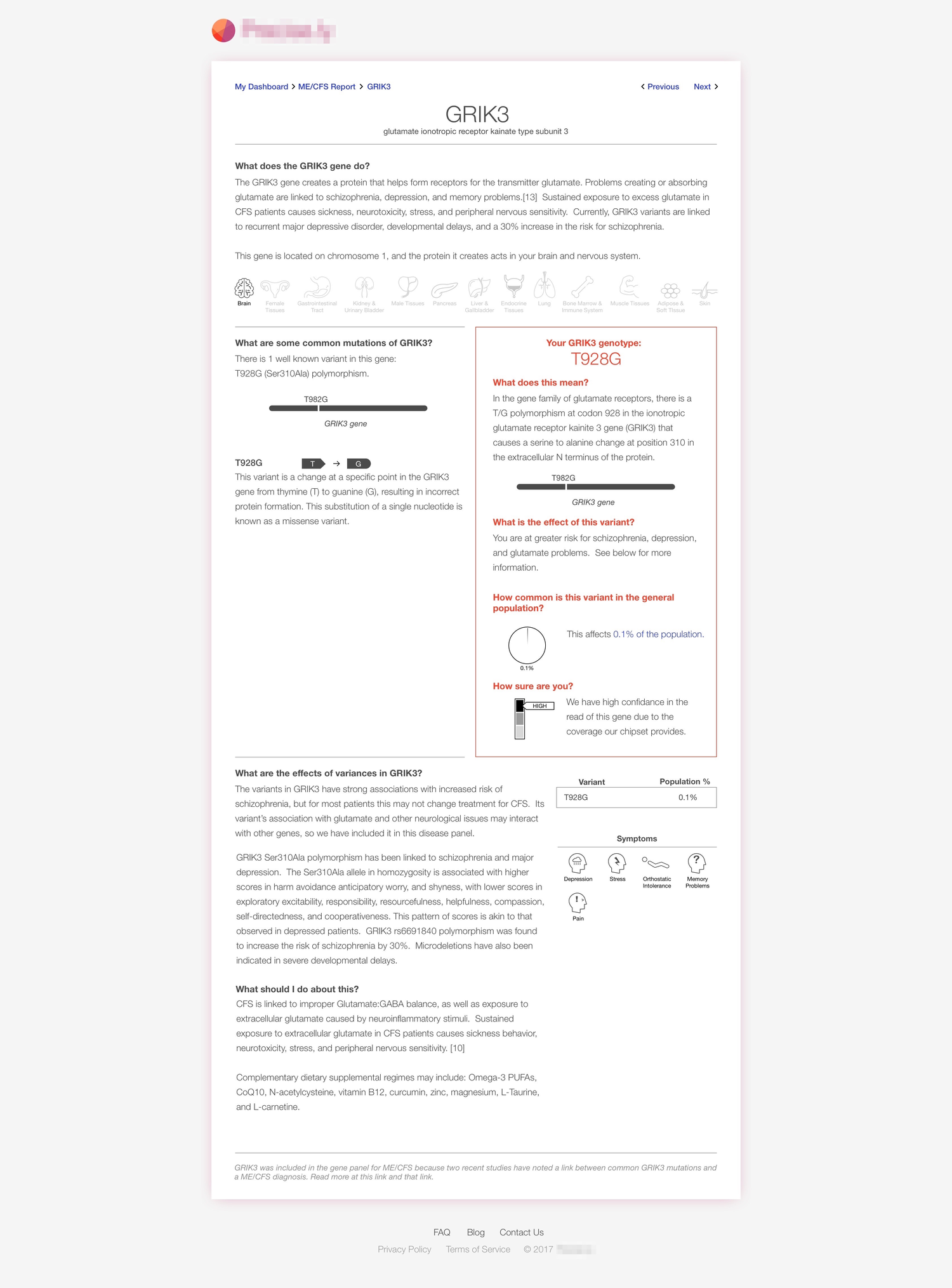
At this point I had established the new color palette and was using our orange and green colors as an outline to draw attention to the callout rather than the yellow background of before. I also adopted a gray background to make the white of the report “page” stand out. I tried to add as much iconography as possible to add visual interest: body parts, genes, nucleotides, meters, and pie charts.

I dropped the two column approach and used a horizontal stacking layout, which is much cleaner and less chaotic for the user to read.

The finishing touches were using colorful graphics to explain all the possible variants a user might have, and whether they have it or not.
Branding
The name and logo were already established when I was hired, but I felt it needed some tweaking to look more distinctive and to better communicate the brand.
Design Process
The original palette was limited to shades of orange and magenta. The lack of contrast meant that the logo appeared muddled at smaller resolutions. But more importantly, this limited palette didn’t give us a lot of choices when it came to representing data with color. And using color to communicate information was essential to make such a data-heavy service look visually appealing and maintain user interest.

One of my first assignments was to create business cards. I didn’t just want to drop the logo onto a white background, add the contact info, and call it a day.
The original logo was a circle that masked a collection of overlapping area charts. The idea was: if we get a large group of people with a specific genetic illness to track their symptoms, we can observe correlations in the data that can point to novel treatments. This logo represented such a correlation. I ran with this idea and wanted to see what this group of overlapping graphs might look like if we zoomed out to see the whole screen. The result was beautiful and dynamic, so I played around with saturation and outlines until I found a graphic we could use on the business cards.
This is what I settled on for the early business cards—The overlapping graphs are present but with diminished opacity in the background, and reveal what the circular logo actually represents.

When I happened upon the design for the Landing Page—that of the tinted faces overlapping—I chose those four tints to be our new color palette. The added cool tones of green and blue gave the palette much more flexibility for the app design tasks that would follow. Now I needed to re-do the logo, so I re-arranged the colors in the 24 arrangements possible with 4 colors so I could see which overlaps would come closest to an attractive arrangement for the logo.

Once I figured out an overlap order I liked, I took that one and swapped out all the color positions to find the best ones. I’m nothing if not thorough!

Key to the color order was the what the resulting circular logo would look like. Here’s the same 24 background graphics with the circle masked in the center.

After a series of eliminations, I came to an arrangement that had potential. The tones were a little muddy, so I played with the shades, saturation, and brightness to liven it up. As a finishing touch, I added thin white outlines to make the vibrant colors pop even more.
The final result: a more dynamic logo with clearly articulated colors overlapping. The rainbow-like variety that resulted from these colors overlapping does a solid job of communicating the infinite variety of genetic combinations that this company seeks to make sense out of.